The Choices and Prototype for UI and The Problem with Resolution in RPG Maker VX Ace
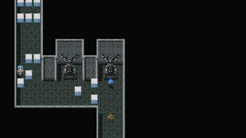
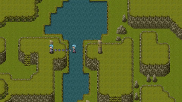
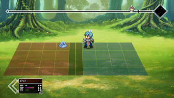
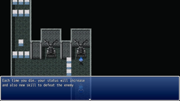
The first blog post for Song of the Bereaved! Because I forgot to make one for a thing before.
So, we have discussed these two things: UI for Song of the Bereaved, and the problem with resolution in RPG Maker VX Ace. And I'd like to share it with you guys.
UI for the game
I'll start with UI first since it's less technical than the other one. We have two types of UI, the one you see on the menu and the one you see when you're playing. The menu's initial design, fortunately, has been delivered by the lovely artist here:
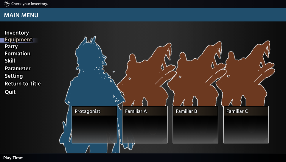
This is the menu you'll see when you press escape. The uppermost is the hint on what you should be doing. Then the next one is the name for the menu (it'll be changed later from 'main menu'). Then next are the menu choices to check or to customize something; Inventory is of course to check inventory; Equipment is to change the equipment for the party; Party is to check the status of the party; Formation is to set your initial places for the battle; Skill is to check and set the skills you'll use for the battle; Parameter is to set up your stats; Setting is to change options around the game; Return to the title is, of course, go back to the menu; and Quit is exit the game. In the center is the information summary of your current party, which familiar you bring, what skills the member party has, and the stats summary for each of them.
The artist said that they'll change a bit here and there, especially the font, so expect an update about this later!
The next one is the UI you'll see when you're playing (when you're not pausing). This UI's purpose is to help you, as the player, to know which map skill is currently active for the MC because the MC has several map action skills and the players need to change between all of them in regard to the situation. We got two choices for this, and both of them can be implemented and are cool to look at.
- The first one is a pop-up above the head when the skill is changed, then the sprite will change form to the skill you choose. It's minimalist and would be cool to look at the different forms the MC has.
- The other one is a constant UI on the top left of the screen. A framed icon and button prompt that will change when the skill is changed. This won't have the players memorize anything since they can check each time before using the skills.
It was a tough decision but we decided to implement the second one. It's better for the player to be able to check rather than to memorize each form and function, especially if the sprite might be too small on some screen and might not look that different.
The problem with the resolution
The next one is the resolution problem. If you might not know, RPG Maker VX Ace's default resolution is small compared to the screen's resolution that is popular these days. With the significant difference between them, players with a big screen resolution will either see a blurred picture or get uncomfortable with the small game window on the center of the monitor. Someone solved this and made a plugin so you can change the default resolution, but this led to a problem, which is a crash that might or might not happen to players that play with a big screen resolution. Then I remember someone re-implement graphic's function for RPG Maker VX Ace by making a replacement for the game.exe called RGDirect (is this the right paraphrase?), shout out to invwindy on the RPGMakerWeb forum. This game.exe replacement, however, led me to another problem, which is an incompatible plugin. The grid battle that I'm using for this game might be incompatible since I got 'crash to desktop' (CTD) several times when testing it. So, I need to change the battle system from a grid battle system to a simple ATB side-view battle system if I'm going to use RGD.
To summarize, I have a modified default game screen resolution and I would like to minimize any chance of CTD players might have when playing this game. We got three choices for this:
- One is to revert the default game screen resolution. This one has the least risk, only need to reduce the size of the pictures and revise the layout for a lot of things
- Two is to keep the resolution and use RGD, but change the battle system from grid ATB to simple side view ATB. This one has the most effort, from learning RGD, changing the skills and the AI for the battle, and maybe many more that we might discover.
- Three is to keep everything unchanged. This one has the least effort, but we got a risk of players crashing without being able to do anything about it.
After a long discussion, we've decided to revert and reduce the default game screen resolution to the RPG Maker VX Ace's default. Risking players CTD when playing the game might impact the impression of the game, and we don't have much time to learn RGD. We would like to, though, so be on the lookout when we finally implement RGD for our games in the future.
It was a great learning discussion for all of us on the team, and hopefully, you can learn a thing or two from this.
Thank you for reading, and don't forget to check out the game!
See you on the next blog!
------------------------------
Make sure to follow us on social media to not miss any important news!
Discord: Dragon Emperors Discord Server
Facebook: Dragon Emperors on Facebook
Twitter: @dragonemperorss
Tumblr: @dragonemperors
Instagram: @emperors.dragon
Files
Get Song of the Bereaved
Song of the Bereaved
An RPG following the story of a hero to defeat a corrupted sentient weapon. Death is not the end.
| Status | In development |
| Authors | Dragon Emperors, Black Mage |
| Genre | Role Playing |
| Tags | 2D, Fantasy, JRPG, Pixel Art, Singleplayer |
More posts
- Visual Patches, a Whole Lot of ThemAug 05, 2022
- The Evil Being Destroyed Your Kingdom! What Do You Do?Aug 04, 2022
- What's behind the names Pt.2Aug 02, 2022
- What's behind the names Pt.1Jul 30, 2022
- How We Design the MonstersJul 28, 2022

Leave a comment
Log in with itch.io to leave a comment.